Exclusive interview with Peter Marino: The famous creator talks to DS about the new Chanel 18 Place Vendôme flagship boutique
DS.WRITER:
Βασίλης Ξιφαράς
Peter Marino is known for the edgy appearances he makes and the glamourous projects he conducts for A-list fashion brands. One of his first architectural works was done for Andy Warhol and after that, many legends of the fashion industry wanted him to design their own homes and their stores. Peter Marino works like a young artist full of enthusiasm and creates not only unique shopping experiences and window showcases but also sculptures and installations. CHANEL has collaborated with the avant-garde architect on numerous occasions, including the design of 18 Place Vendôme as the company’s flagship boutique in 2007.
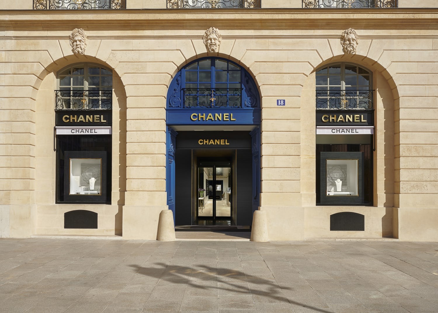
The entrance. Photo by: Chanel
15 years later, Peter Marino was commissioned once again to revitalize Maison 18. Classic and timeless pieces of art are displayed in a space equipped with new technologies and handcrafts, under a common modern architectural language, creating not only an image, but an exclusive experience that depicts the values of CHANEL.
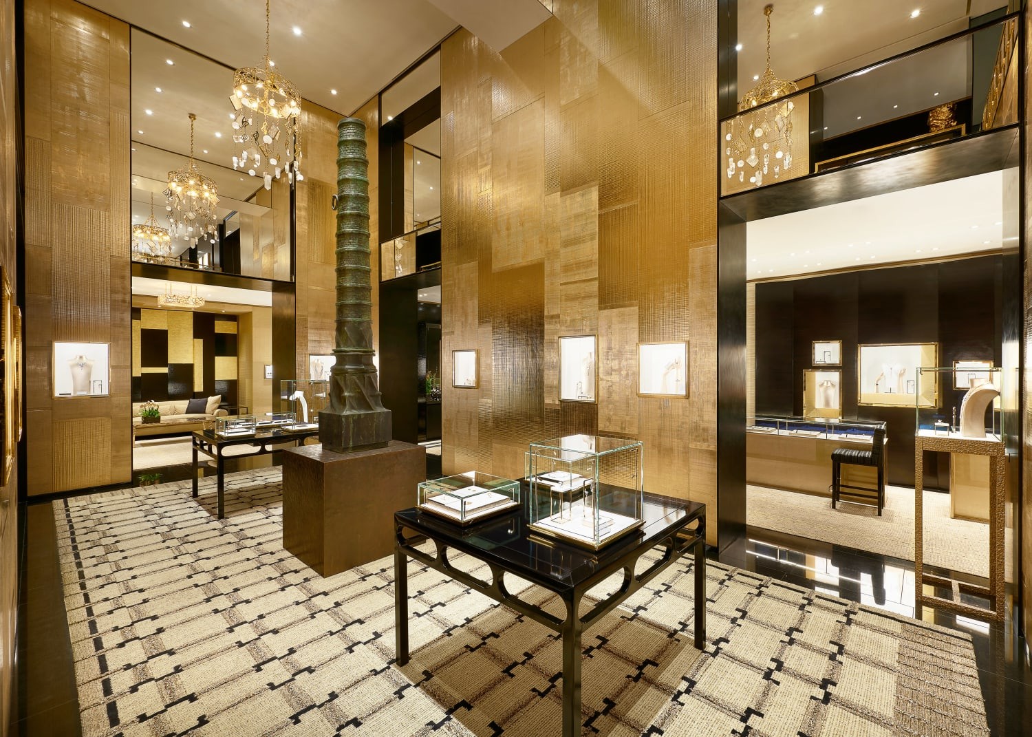
“La Borne” sculpture by Johan Creten at the center of the ground floor. Photo by: Chanel
The atmosphere is already set at the entrance, where transparent features underline the gold, beige and brown shades of the panels and furniture. The first pieces that stand out are the console by Delos & Ubiedo and the print “Eternal Movement” by Idris Khan. The plan is defined by the ambient golden atrium, with Johan Creten's 3 - meter - tall sculpture “La Borne” dominating the central space. Towards the back, a touch of nature is given through the “Wapiti” bronze sculpture by François - Xavier Lalanne, while the contemporary silver steel sculpture “Coco Chandelier” by Joel Morrison, especially created for the renovation of the boutique, shows the way towards the first floor.
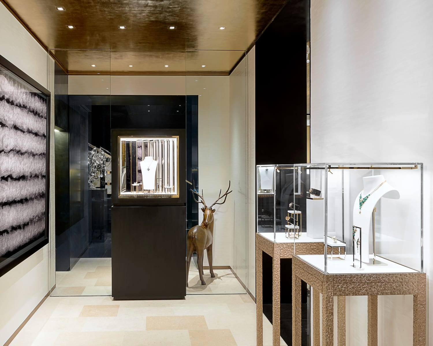
“Eternal Movement” print by Idris Khan and “Wapiti” sculpture by François - Xavier Lalanne. Photo by: Chanel
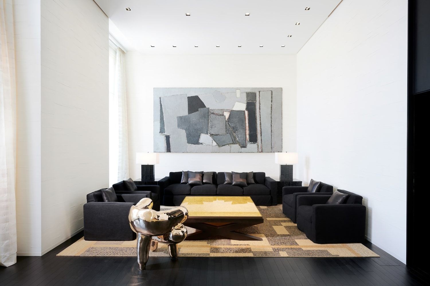
The setup of the first floor reminds us of a lounge, as CHANEL gives high importance to human interaction. A private salon features a portrait of Mademoiselle Chanel made out of diamonds by Vik Muniz, a sculpture by Sophie Coryndon in 24-carat gold leaf, wood and jesmonite, a Louis XV bureau, a gilded table by Garrido and a Chinese porcelain lamp inlaid with mother-of-pearl. The design on the second floor remains luxurious, although white tones are more prominent. A sculptural bronze armchair by Voukenas Petrides and a coffee table by Reda Amalou showcase the gold and brown touches that unify every room in Maison 18.
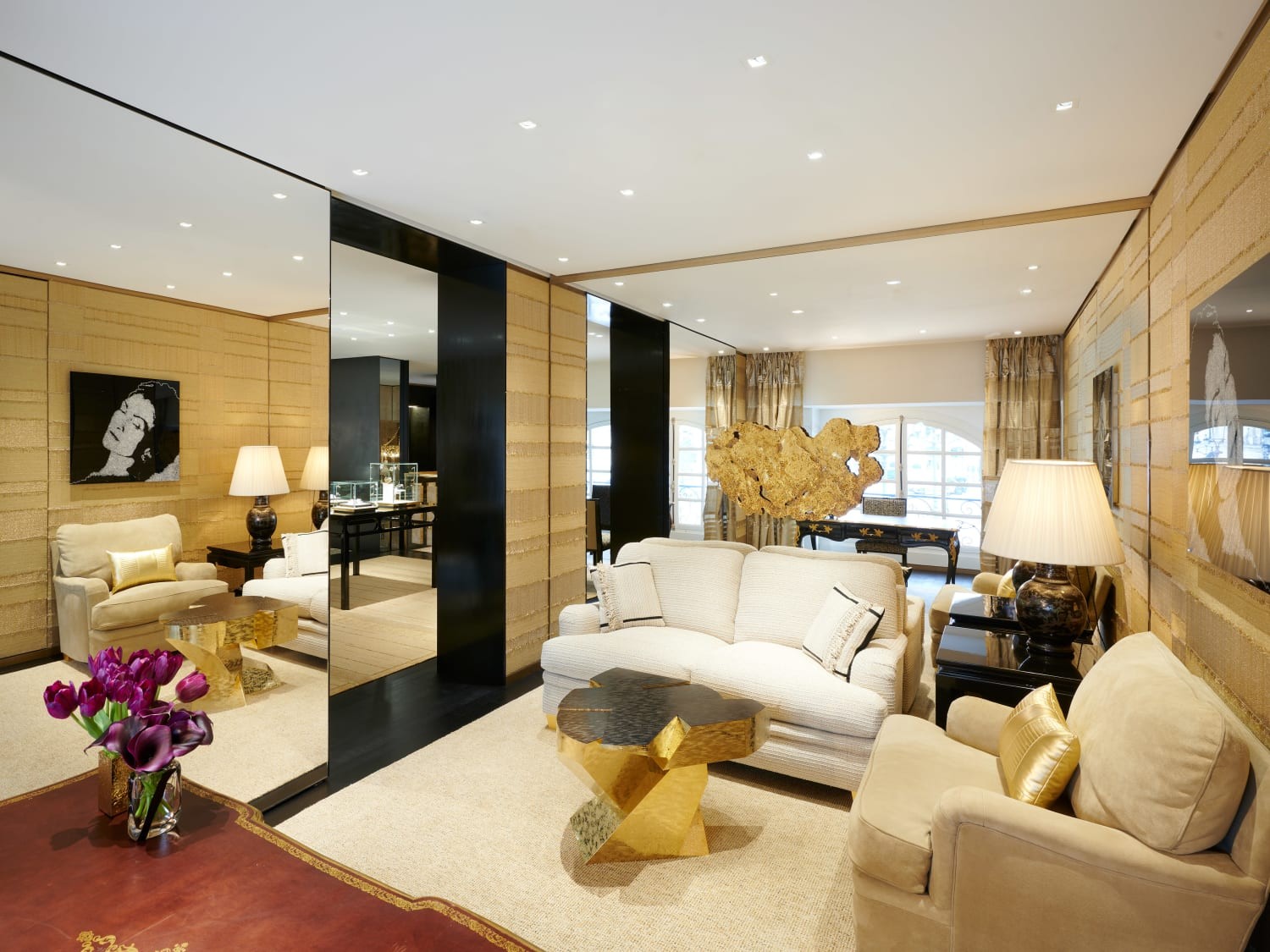
The private salon on the first floor. Photo by: Chanel
Peter Marino, in his own words, offers a unique glimpse into the creation of the new contemporary landmark:
What was your vision behind this new era of Maison’s 18, Place Vendôme flagship?
It is a combination of luxe with modernity. I think that suits CHANEL very well.
The palette explores white, gold, black and beige – the colors of CHANEL. But within this, I explored five or six different textures. Take lacquer, a real standby for Gabrielle Chanel, which is here interpreted uniquely across the ground floor’s salons.
Working with specialist ateliers and the rare crafts they deploy is a commitment to time. CHANEL is an extraordinary company, with great craftsmanship. I'm always awestruck by the constant creativity of the brand, from its fine jewelry collections to Haute Couture. It is not a static house.
To start with the most elaborate décor on the ground floor and as you work your way up, the design gets simpler. The top floor is the simplest: when you see the Haute Joaillerie pieces, you are in a sort of “white room” with very little distraction. Just the killer view and the Nicolas de Staël painting.
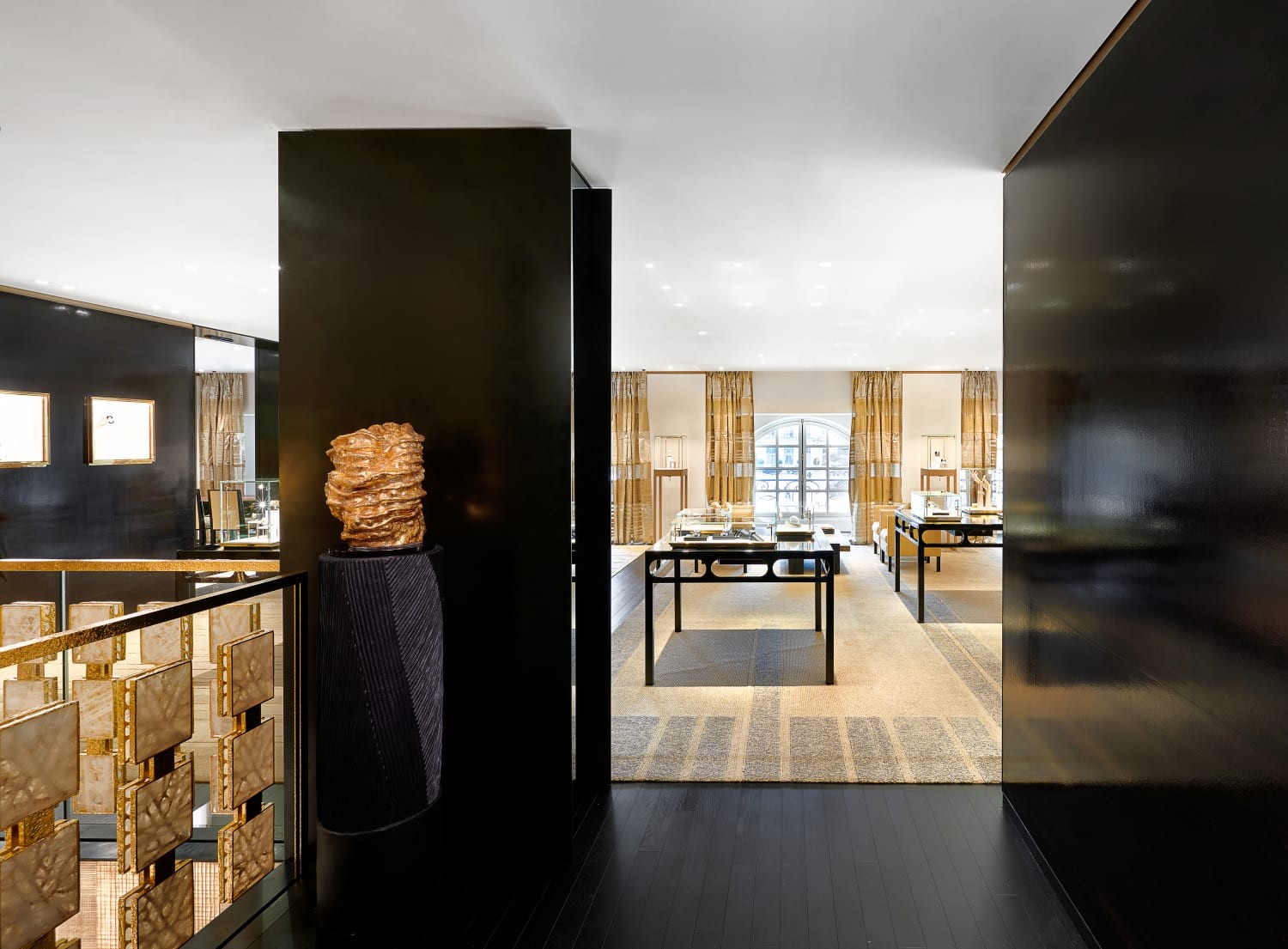
Photo by: Chanel
What are the key works of art that you have chosen for the 18, Place Vendôme?
At the entrance, there is Idris Khan’s Eternal movement, a digital chronomogenic print of free-flowing lines. I find it romantic, poetic. It has a modern lyricism that I find equivalent to CHANEL’s. Many say Gabrielle Chanel was strict, so strict, but the ribbons she put on her neck or in her jewellery speak of a lyric note. If she were just strict boxes, she wouldn’t be Chanel.
Then we commissioned sculptor Johan Creten to create a column that would reinterpret the Colonne Vendôme outside, itself inspired by the Trajan Column, a monument which fascinates me and which is as famous as the Eiffel Tower.
There are also several of my Bronze Box sculptures, which are art editions. I am very proud of them. It takes a lifetime to find your voice to do something that doesn't resemble anything else out there that is original and unique and beautiful.
At the base of the staircase is “Coco Chandelier”, a portrait of Gabrielle Chanel by California- based sculptor Joel Morrison, who worked in a motorbike shop. I commissioned him because he has a modern touch. I love fusing and infusing classic lines with that kind of energy. I felt the result would be chic. I took the chandelier in her 31 Rue Cambon apartment as an element and he reinterpreted the fer forgé arms coming out of her head, tipped with big drops of rock crystal. These go together as all about the chandelier. For me, that is meaningful, and I have great fun.
And then there is the Nicolas de Staël!
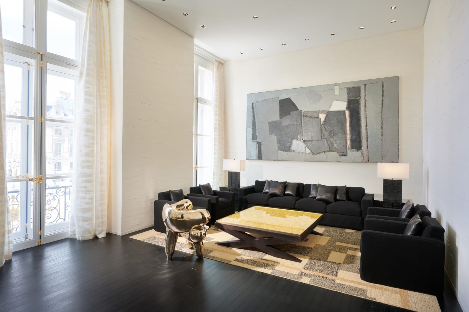
Armchair by Voukenas Petrides, coffee table by Reda Amalou and painting by Nicolas de Staël. Photo by: Chanel
You share an astonishing connection with “Composition”, the 1950 oil painting by Nicolas de Staël which is placed in the Grand Salon. Can you unveil your shared history?
Paintings do have their own karma and their own lives – you could write a biography for each and every one.
I had originally purchased “Composition” from Sotheby's in London more than 20 years ago on behalf of a client, who later sold it.
When CHANEL mentioned this was the painting they considered buying, I thought it was wild. But the house felt it really represents the same kind of luxurious modernism, forward thinking but at the same time, bearing this sort of ancient eternalism that represented the values of CHANEL well. I was thrilled.
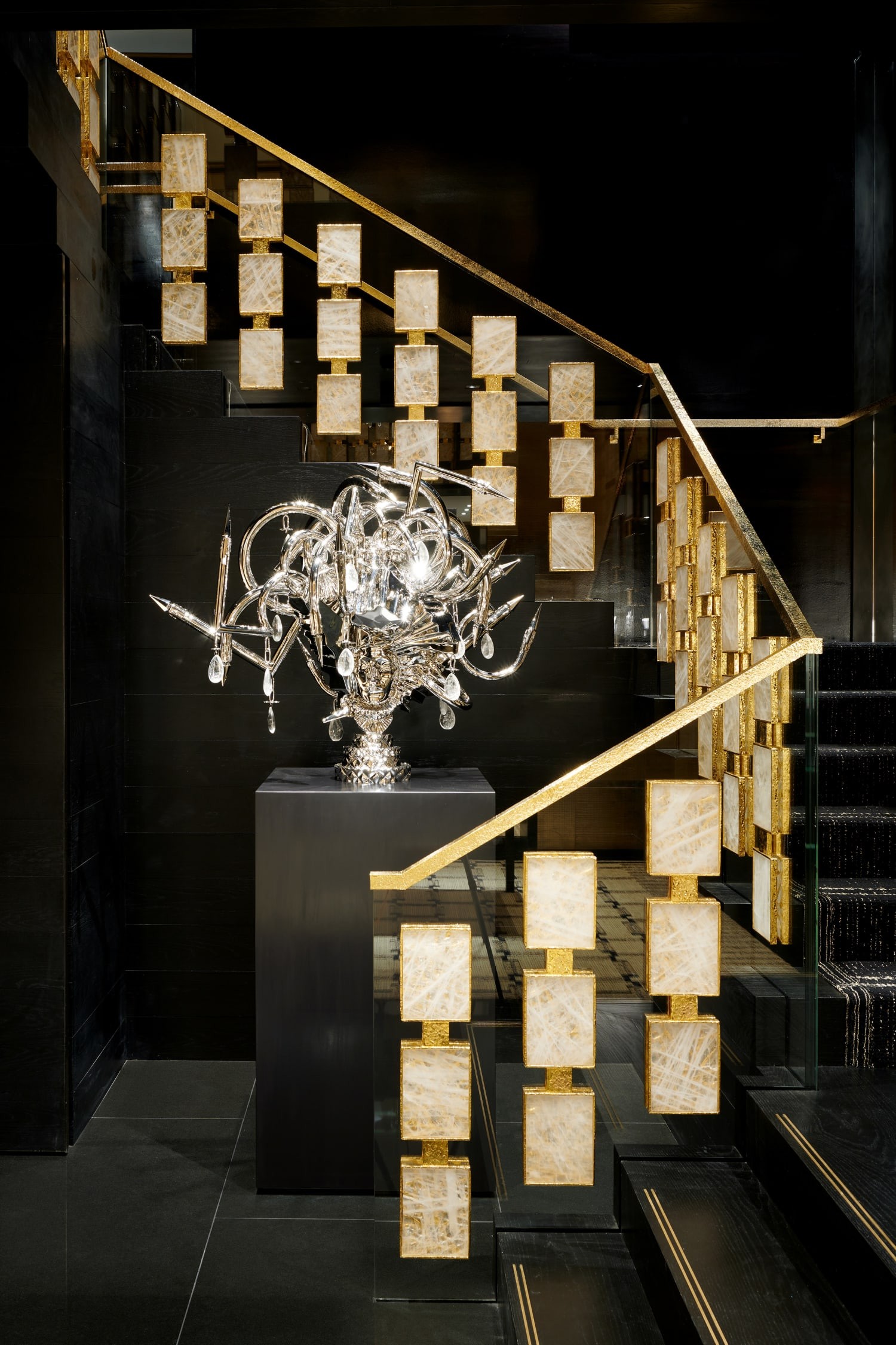
“Coco Chandelier” portrait by Joel Morrison. Photo by: Chanel
What were your favourite parts of this project?
The most fun for an architect is imagining a new staircase. I also greatly enjoyed designing the carpets – I’m a design-maniac regarding these!


